FX Experience Has Gone Read-Only
I've been maintaining FX Experience for a really long time now, and I love hearing from people who enjoy my weekly links roundup. One thing I've noticed recently is that maintaining two sites (FX Experience and JonathanGiles.net) takes more time than ideal, and splits the audience up. Therefore, FX Experience will become read-only for new blog posts, but weekly posts will continue to be published on JonathanGiles.net. If you follow @FXExperience on Twitter, I suggest you also follow @JonathanGiles. This is not the end - just a consolidation of my online presence to make my life a little easier!
tl;dr: Follow me on Twitter and check for the latest news on JonathanGiles.net.

by Jonathan Giles | May 6, 2012 | General, Layout, Scenic View, UI Design
Update: More recent releases of Scenic View have been released since this post! Go to the Scenic View page to download the latest release!
Developing user interfaces is tricky, regardless of whether you’re just trying to understand the high level scenegraph layout, or whether you’re pushing pixels for a finely tuned user interface. I understand and feel for people in this situation. UI developers come up with all kinds of tricks, for example, temporarily introducing a bold one pixel border of varying colours around components to better understand the user interface. I certainly know I have done that countless times in the past when building user interfaces, and frankly, it is painful and massively time consuming.
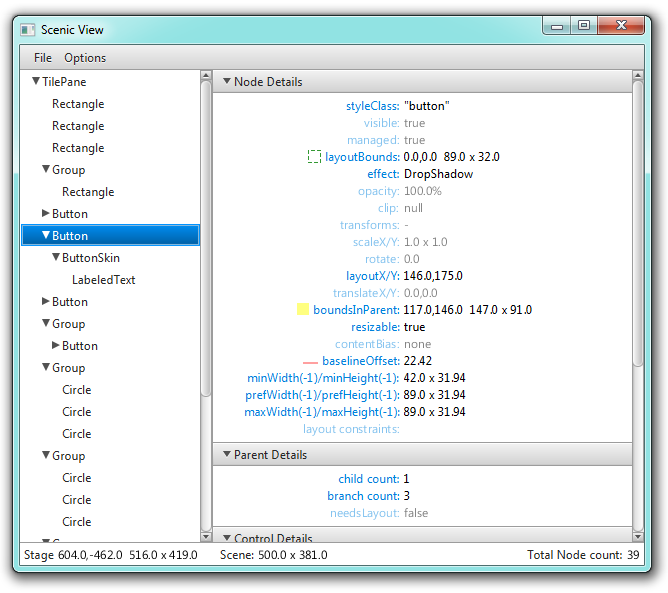
Inside the JavaFX team, since times of yore (that is, since at least JavaFX 1.3, but perhaps earlier – my memory fails me here), we’ve had this remarkable little tool that was called Scenic View. It somehow just burst into existence, through the brilliance of Amy Fowler, whom many should know as the layout guru for both Swing and JavaFX. Scenic View is a tool that can be called to browse a live view of the application scenegraph. Here’s a screenshot:
 (more…)

by Richard Bair | Feb 6, 2012 | Controls, CSS, FXML, Layout, Tips n' Tricks, UI Design
One of Jasper’s favorite websites is called Dribbble, which is a place for designers to post whatever work they’re currently working on for others to view and be inspired from. I got hooked on Dribbble last Thursday and have been looking at a bunch of the mockups and itching to try implementing some of them in JavaFX. Here is my first attempt.

One of the use cases we used for our CSS support and our ToolBar API was that we wanted to support a style of toolbar button which (at least for me) was popularized on the Mac, which is referred to by Cocoa as a “segmented” button. This is essentially nothing more than an HBox of buttons that has been styled such that the first button has rounded left edges, the center buttons are squared up, and the last button has rounded right edges. In the image above by Bady, you can see the segmented button bar in the toolbar area of the application.
(more…)

by Jasper Potts | Jun 2, 2011 | Layout, Links
Great post on layout by Amy Fowler, recommended reading for anyone interested in JavaFX 2.0.
JavaFX2.0 Beta is out. We’ve taken advantage of the language shift to extensively remodel the layout APIs based on a year’s worth of tire-kicking. This article (the first in a series) will introduce you to the basics. ….More

by Jonathan Giles | May 30, 2010 | Layout, Links
Building decent-sized applications requires layouts (unless you like pain), and the funny thing about layouts is that they’re tough…..real tough……until you bother to actually understand them. The second funny thing about layouts is that once you do understand them they’re simple and powerful. An added bonus is that your head stops hurting and your curse-words jar becomes considerably less overflowing. Finally, your children/partner/pet/pet-rock will love you more and the world will become a happier, more smiley place. This is the power of understanding layouts.
So, please, if you don’t know how to use the JavaFX layout containers, go and read Amy Fowler’s new blog. It is starting off with a bang, covering what’s new and changed in JavaFX 1.3 – and it’s well worth your time to read it. Keep reading each post until it makes sense. If you go cross-eyed or consider giving up, you’re doing yourself an injustice. Read it again!
For convenience, here’s the links you’ll want to read:
Now, go forth and read! 🙂

by Jasper Potts | Sep 17, 2009 | Layout, Links
Amy Fowler the layout guru has written a excelent article on layout in JavaFX 1.2, recomended reading for anyone working with or learning JavaFX.
JavaFX’s powerful scene-graph and animation engine enables gamer types to rapidly create dynamic visual scenes that are functionally expressed through binding and triggers and timelines. On the other, it’s growing controls and charts libraries clearly stake out a more traditional GUI turf. As interfaces finally graduate to the 21st century, the lines between these two worlds is blurring in exciting ways. Our challenge is to evolve the FX platform to support this convergence, which speaks precisely to why layout in JavaFX is complicated enough that it requires a blog series to explain.

by Richard Bair | Jun 7, 2009 | Charts, Controls, Layout
There’s a great article over at InformIT by Jim Clarke about what’s new in JavaFX 1.2. Jim has been involved in JavaFX both contributing to the source and building apps since before I got involved last year.
From the article:
Once you start using JavaFX, I think you’ll find that the language is powerful yet very concise. You’ll be amazed at the things you can do with very little code. I have only discussed a few of the new JavaFX 1.2 user interface features—there’s much more to the entire JavaFX platform. I hope that this overview will provide just enough enticement for you to start your own exploration.
