One of Jasper’s favorite websites is called Dribbble, which is a place for designers to post whatever work they’re currently working on for others to view and be inspired from. I got hooked on Dribbble last Thursday and have been looking at a bunch of the mockups and itching to try implementing some of them in JavaFX. Here is my first attempt.

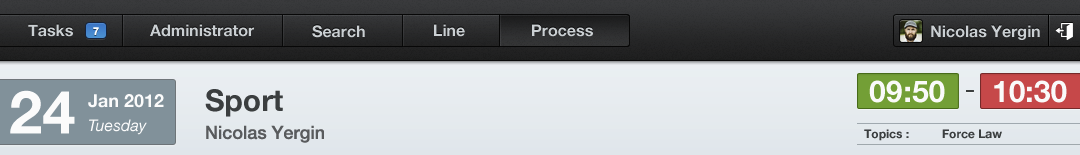
One of the use cases we used for our CSS support and our ToolBar API was that we wanted to support a style of toolbar button which (at least for me) was popularized on the Mac, which is referred to by Cocoa as a “segmented” button. This is essentially nothing more than an HBox of buttons that has been styled such that the first button has rounded left edges, the center buttons are squared up, and the last button has rounded right edges. In the image above by Bady, you can see the segmented button bar in the toolbar area of the application.
So to begin with, here is the Java code that goes into producing this app. This one is going to only have a toolbar, segmented button bar, and then the body area will just be the blue color you see in the above design. I actually will list two different examples here which both produce the same view and which both use the same CSS file. The first is just plain Java, while the second uses FXML to define the UI and a Java file simply loads the UI and configures the stage.
SegmentedButtonBarApp – Just Java
public class SegmentedButtonBarApp extends Application {
    @Override public void start(Stage stage) throws Exception {
        BorderPane root = new BorderPane();
        root.setId("background");

        ToolBar toolBar = new ToolBar();
        root.setTop(toolBar);

        Region spacer = new Region();
        spacer.getStyleClass().setAll("spacer");

        HBox buttonBar = new HBox();
        buttonBar.getStyleClass().setAll("segmented-button-bar");
        Button sampleButton = new Button("Tasks");
        sampleButton.getStyleClass().addAll("first");
        Button sampleButton2 = new Button("Administrator");
        Button sampleButton3 = new Button("Search");
        Button sampleButton4 = new Button("Line");
        Button sampleButton5 = new Button("Process");
        sampleButton5.getStyleClass().addAll("last", "capsule");
        buttonBar.getChildren().addAll(sampleButton, sampleButton2, sampleButton3, sampleButton4, sampleButton5);
        toolBar.getItems().addAll(spacer, buttonBar);

        Scene scene = new Scene(root, 800, 600);
        scene.getStylesheets().add(getClass().getResource("segmented.css").toExternalForm());
        stage.setScene(scene);
        stage.setTitle("Segmented Button Bar");
        stage.show();
    }

    public static void main(String[] args) {
        launch(args);
    }
}
SegmentedButtonBarFXMLApp.java and SegmentedButtonBar.fxml – Java and FXML
<?xml version="1.0" encoding="UTF-8"?>

<?import java.lang.*?>
<?import javafx.scene.control.*?>
<?import javafx.scene.layout.*?>

<BorderPane id="background" prefWidth="800.0" prefHeight="600.0" xmlns:fx="http://javafx.com/fxml">
    <top>
        <ToolBar>
            <items>
                <Region styleClass="spacer" />
                <HBox styleClass="segmented-button-bar">
                    <Button text="Tasks" styleClass="first" />
                    <Button text="Administrator" />
                    <Button text="Search" />
                    <Button text="Line" />
                    <Button text="Process" styleClass="last" />
                </HBox>
            </items>
        </ToolBar>
    </top>
</BorderPane>
public class SegmentedButtonBarFXMLApp extends Application{
    @Override public void start(Stage stage) throws Exception {
        Parent root = FXMLLoader.load(getClass().getResource("SegmentedButtonBar.fxml"));
        Scene scene = new Scene(root);
        scene.getStylesheets().add(getClass().getResource("segmented.css").toExternalForm());
        stage.setScene(scene);
        stage.setTitle("Segmented Button Bar From FXML");
        stage.show();
    }

    public static void main(String[] args) {
        launch(args);
    }
}
Both of these approach yield the same approach. I think the FXML file in this case is easier to visualize than reading the raw Java code, but either approach is valid. In both approaches you will notice that I have not done any visual styling whatsoever in the code or FXML, it has all been abstracted away to the css file. Here is what the application looks like without any CSS being applied.

So now lets apply one section of the CSS file at a time, and see how it modifies the look of the application.
The CSS
I started off by defining the following rule in CSS:
#background {
    -light-black: rgb(74, 75, 78);
    -dark-highlight: rgb(87, 89, 92);
    -dark-black: rgb(39, 40, 40);
    -darkest-black: rgb(5, 5, 5);
    -mid-gray: rgb(216, 222, 227);
    -fx-background-color: -mid-gray;
}
There are two things going on in this code. First, you will note that it selects only the node(s) with the id of “background”. The node in our scene graph with this id is the BorderPane which forms the root of the scene graph. The first chunk of the CSS file defines the color palette. In JavaFX CSS you can create arbitrary “variables” in your CSS by simply defining a declaration, such as -dark-black: rub(39, 40, 40);. Thereafter, you can refer to these named colors.
SegmentedButtonBar Palette
After doing nothing other than defining the color palette and the background, our app now looks like this:

The background now has this mid-gray color, while the rest of the app looks unchanged. Now, lets style the ToolBar.
.tool-bar {
    -fx-base: -dark-black;
    -fx-font-size: 12pt;
    -fx-background-color:
        linear-gradient(to bottom, derive(-fx-base,-30%), derive(-fx-base,-60%)),
        linear-gradient(to bottom, -light-black 2%, -dark-black 98%);
    -fx-background-insets: 0, 0 0 1 0;
    -fx-padding: .9em 0.416667em .9em 0.416667em;
    -fx-effect: dropshadow(two-pass-box,black,5,.2,0,0);
}
Here, I am selecting all toolbars in my app to be styled like this. I could have given my tool bar a special style class or ID so that I only targeted it, but in this case this is OK, since I am not using any other tool bars in my app, and if I were, I could style them explicitly by style class or ID if I wanted to. I am telling the toolbar to use the base color of -dark-black. I think the only reason for doing so is so that those automatically derived colors that I’m not about to override (of which I think only the text fill is ultimately going to be affected) will be styled correctly by default for being on a dark background. I’ve tweaked the font size to be a bit smaller (on mac it defaults to 13pt).
I’ve given the toolbar a new background gradient. It simply goes from top-to-bottom. I actually copied this out of caspian.css and then modified the main gradient (the second one in the list) to go from our -light-black palette color to our -dark-black gradient color. I tweaked the insets so that the border (the first gradient in the list) isn’t drawn on the bottom of the toolbar. I also tweaked the padding so that it would come out pretty close to the designer’s intent. Finally, I added a drop shadow.

Now that we’ve styled the tool bar, it is time to style the segmented buttons (that is, after all, what this post is supposed to be about!). Actually styling the segmented buttons is really pretty easy.
.segmented-button-bar .button {
    -fx-background-color:
        -darkest-black,
        -dark-highlight,
        linear-gradient(to bottom, -light-black 2%, -dark-black 98%);
    -fx-background-insets: 0, 1 1 1 0, 2 1 1 1;
    -fx-background-radius: 0;
    -fx-padding: 0.4em 1.833333em 0.4em 1.833333em;
}

.segmented-button-bar .button.first {
    -fx-background-insets: 0, 1, 2 1 1 1;
    -fx-background-radius: 3 0 0 3, 2 0 0 2, 2 0 0 2;
}

.segmented-button-bar .button.last {
    -fx-background-insets: 0, 1 1 1 0, 2 1 1 1;
    -fx-background-radius: 0 3 3 0, 0 2 2 0, 0 2 2 0;
}

.segmented-button-bar .button:pressed {
    -fx-background-color:
        -darkest-black,
        rgb(55, 57, 58),
        linear-gradient(to top, -light-black 2%, -dark-black 98%);
}
The segmented buttons are styled such that the first and last are half-rounded, and the middle buttons are squared up. With web CSS you have the “first-child” and “last-child” pseudo-classes. However these are not implemented in JavaFX, so instead I added the “first” and “last” style classes to the first and last buttons, respectively. This allows me to use a nice CSS rule to target them separately from any other random button added to the segmented button bar.
Oh, and my “segmented button bar” isn’t a control — it is just an HBox with some special CSS style. I gave the hbox the style class “segmented-button-bar”, and then here from CSS I will target all buttons that are within a segmented-button-bar, and style them specially.
The button is drawn using 3 overlapping background fills. The first is the dark outline, the second is the “highlight” — a lighter line draw to give the bezel look, and then the gradient that fills the rest of the body. The only trick with these is to correctly specify the insets and the corner radius’ so everything ends up looking right. Look closely at the following zoomed-in screenshot of the design:

You will notice that there is, on the left of this button, a black line and a highlight line. So does the black line belong to the button to the left of the “Search” button? Who draws it? In my case, I decided that the highlight line on the left would be drawn by this button, and the dark line on the right would also be drawn by this button. Thus you can butt multiple buttons against each other and they appear to “share” a border. Notice that the middle button draws the black lines on the top and bottom. So basically what I did was draw the black background, then draw a highlight background overtop of it adjusted such that it drew over most of the black background, just leaving 1 px on the top and bottom showing through. Then I drew the main fill adjusted so that the highlight was obscured except for 1 px on the top and left.
The first and last buttons were likewise tweaked to get the right look. The only additional thing done there was to make sure that the corner radius for the top-left and bottom-left edges (for the first button) were rounded and the top-right and bottom-right were squared. The same idea for the last button.
And that’s it. A SegmentedButtonBar where you can drop in buttons and they will be styled to match the colors, gradients, and so forth that the designer intended. And done by me: somebody who, unlike Jasper, isn’t very good at making a pretty UI 🙂
Oh, you may be wondering about that “spacer” region. I just gave it a simple style to push over the button bar a little ways.
.tool-bar .spacer {
    -fx-padding: 0 5.417em 0 0;
}
And finally, our app looks pretty good!


Nice job! cool!!
It looks amazing. Nice work Richard.
Ha, I noticed my CSS had a bug. I updated the .segmented-button-bar .button.first to use this as the -fx-background-radius:
-fx-background-radius: 3 0 0 3, 2 0 0 2, 2 0 0 2;
It was:
-fx-background-radius: 3, 2, 2;
This had made the right two corners rounded, and it showed in the final image. I’ve updated both the image and the text however to show the correct values.
Very nice work Richard, thx! 🙂
I tweaked the code a little bit and encountered a weird problem.
First, i exchanged the buttons for ToggleButtons and then put all of them into a ToggleGroup, so that only one of them can be selected at once.
In my CSS i also added a slighty different gradient for the “selected” state for the toggle buttons.
If i start the application, everything works as expected.
But when i maximize the window, the “selected” state of the buttons doens´t change anymore visually when i click a button.
The button click is still registered (the correct ActionHandler for every button is fired) and i also checked the “selectedToggle” of the ToggleGroup, which is the last clicked button.
But visually, the buttons don´t switch anymore between the “selected” and the default state.
Is this an error in my code, or a problem with JavaFX?
The CSS i added is
.segmented-button-bar .toggle-button:selected {
-fx-background-color:
linear-gradient(to top, -mid-black 5%, -dark-black 75%);
}
I just used ToggleButtons and put them into a ToggleGroup, other than that, its your code.
Well done! This component is very handy.
Richard,
coincidentally, I am working on a similar thing. So far it has been pretty rewarding – except for looking quite different after a recent switch to 2.1 beta.
Anyway, I am looking for a simple way to put this into a custom control with the following features:
– control “skin” is defined in fxml
– the control can be used seamlessly in other fxml just by importing the control class, and it should support custom attributes
– simple: ideally there is only one control class and the fxml
Basically, I am looking for a way to easily create aggregate controls…
Any suggestions?
This is really an excellent tutorial. I would surely try it out today itself.
Hey i have question where can get JavaFx CSS tutorial
Thanks for this excellent tutorial. i tired it with toggle button and i used a togglegroup it works much better than buttons.
Hey! I really appreciate this tutorial!!!
Thanks a lot!
By the way, is there any way to style the button in order to add a badge containing the number, like on the Dribbble screenshot? I am finding this very challenging and I don-t know how to implement it!
Very Cool Thanks Richard 😉
i want to increase the height of segmented button and apply different background color to it.
Is it possible?