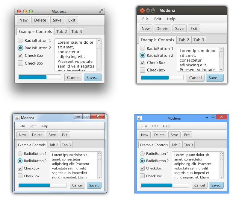
We have been working really hard on the new Modena theme for JavaFX 8. I think we are finally really close so I wanted to share with you where we got to. I really hope you like the progress and direction. We took a lot of the feedback from the last blog into consideration. Overall though I am really happy and feel that this is going to do as much as we can to make JavaFX applications look great out of the box.

Retina Mac
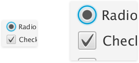
For those lucky enough to be running on Retina Mac then we also have support for Retina now in JavaFX 8 and with Modena so enjoy.

Trying for your self
The almost final version of Modena will be available this week in Java 8 Early Access build 81. For instructions for enabling Modena and running the test application see the first Modena blog post.
Windows – Default 12px font

Mac


Beautiful. The orange is gone. Simply awesome!
Thank you!
Great! It’s great that you listened to users feedback. Now it looks even better.
Great work
Nice work. The Toggle Button on the Mac has poor contrast though.
MUCH, MUCH, MUCH better!!!
If only font rendering…:(
As I mentioned below we had not turned on Native LCD for windows, I just noticed last night. That will be fixed in next build.
For Mac we are working on Native text rendering but I am not sure when it will be finished yet.
God bless your team!!! :)))
It would be amazing!
In general very nice, but still the too rounded corners for the buttons.
Yes finally the blue one i loved it . But still TableView sort icon is something not natural and Tabs too.
Altogether it’s so awesome 🙂 Keep it up
Thanks
Narayan
Fantastic. I like every change you made. Now it’s almost rude to give further feedback. That have never stopped me though. 😉
Minor things.
The gradient on the table header is a bit too much now. And the arrow is a bit to “pointy”. The jury is out if the dots adds value but they are not centered over the arrow. Make sure it’s easy to turn them off.
It would look better if there was one gradient in the header even if the header has multiple rows.
I would like to see if the gray selection rows in lists and tables would look better if they were slightly lighter. Maybe 220.
I would add a very subtle shadow (Like on Titled Pane) on bottom placed tabs. The shape indicate they are sunken and light comes from the top but this isn’t reflected in the upper part of the tabs.
Tabs that are on the left or right should have very little gradient since the lighting comes from the top, not the side.
nice but font rendering in windows is ugly
is nt javafx using the native font subpixel rendering on windows?
I just found out yesterday that we had not turned LCD on for Windows with Modena. We will have native LCD subpixel text on Windows.
Just LCD like current caspian…
Sadly, it is not a fixed RT-23467 🙁
And one more thought, please.
Is it alarming, that javafx 8 loads a lot of swing|awt stuff, while 2.2.6 loaded nothing?
I submitted RT-28267 month ago, but no singe reply…
Thanks anatoliy, I’ve commented on the issue.
Looks great on Linux! 🙂
Looking great !! 🙂
Much better. One thing is the ‘check’ symbol looks quite weird to me.
Thanks for listening to feedback.
default width for menus is small and does not show menu text.
Modena App shows “F…” instead of “Font” in menu for me on windows.
and I get java.lang.OutOfMemoryError: Java heap space error in switching between caspian to modena theme in Modena App.
Can you please file a bug report at http://javafx-jira.kenai.com
Done:
RT-29056
RT-29055
Done.
Beautiful. Really beautiful. Keep going!
Good Job JavaFX
Thanks for removing the orange! That was my biggest gripe. Along with the absurdly rounded corners being removed, I really like it.
Simply awesome.. way to go javafx.
It looks fantastic! But what about functionality? Do we have dialog boxes yet? A replacement for JOptionPane?
Not in the official distribution, but there are a few unofficial versions, such as:
http://edu.makery.ch/blog/2012/10/30/javafx-2-dialogs/
https://blogs.oracle.com/javajungle/entry/monologfx_floss_javafx_dialogs_for
https://blogs.oracle.com/javajungle/entry/dialogfx_a_new_approach_to
Very nice indeed. Imho a significant improvement over the last draft. Kudos as well for listening to the feedback!
Very nice.
But it is better if the color, the theme use the theme that the OS use.
For example, user maybe change the OS theme at different time.we can read the os theme through jni(or JNA), then use the theme to render the javafx theme, it will make javafx have a native looking.
Hi,
Are those “nice colors” and “greys” (the greyscale going from 0%, 10%, 20%, to 100%) part of some palette ?
How does someone use them ?
Thanx
The source code for the application shown in the pictures is available in OpenJFX project under rt/apps/experiments/Modena
You can theme Modena controls using any color. They grey and colors above are just examples. You can theme by setting the “fx-base” color to another color in CSS. For example:
Button myButton = new Button();
myButton.setStyle(“-fx-base: #666;”);
will give you a dark grey button. The base color is inherited so if you set it on a parent node eg TooBar then it will effect the color of that panel and all its children.
Nice! Continue this work, looks great out of the box.
What about Print API JavaFX for Windows XP platforms…
When was going to release…
thanks but i want to download the theme please help me
Totally awesome.
Far more beautiful than Java Swing.
Keep up the awesome work!
This is beautiful! Amazing Job!
awesome work guys! unlike microsoft, you are actually listening to your customers / developers! thanks!
This looks really sleek. Nice, clean and modern. Great Job!
I can’t make sense of two elements in the above list.
a) What is an indeterminate checkbox? Standard usage is that a checkbox is either selected or it’s not, there’s no middle ground. What is the use case for an indeterminate variant?
b) What is a selected toggle button? A button that’s depressed is “armed”, and a button that we selected via JS or via the tab key, or possibly by clicking it, is “focused”. But what is “selected”?
It look really nice, I love the javaFX new styling but i made POS in javaFX its garbage collection is very pure and memory is exhausting after 10 to 15 scene change. So i redesign it back to Swing. But still i love javaFX. My mind says if java is still with Sun Microsystems we never face such an issue.