We have been working recently on a new theme for JavaFX 8. The current theme for FX, named Caspian, is showing its age and we wanted to take the opportunity to give JavaFX a face lift for 8. Because folks have created custom controls and designs for their app, we needed to make sure that selecting the theme was something that you could opt-out of. We will be providing both API and command line switches in 8 to allow you to specify caspian specifically. If you do nothing, you’ll get Modena, our new theme, by default. Without further ado this is what it looks like:
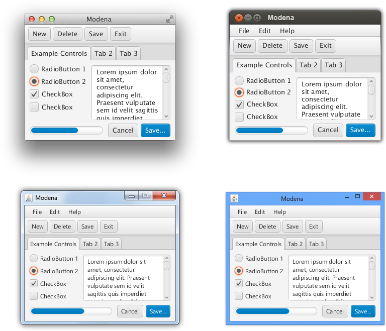
Trying for yourself
You can download build 74 and try it yourself today at http://jdk8.java.net/download.html. To try it out you need to enable it either by setting the command line flag -Djavafx.userAgentStylesheetUrl=modena or by adding the following to your Application start() method:
    @Override public void start(Stage stage) throws Exception {
        ....
        setUserAgentStylesheet(STYLESHEET_MODENA);
        ....
    }
In the future we will switch this so that Modena is the default and you will have to specify Caspian explicitly to use caspian. We’ve tried hard to make Modena compatible with Caspian so that as long as you haven’t been relying on specific insets / padding / etc, your application will “just work” with the new theme. This includes any custom CSS you have done that is relying on the theme colors defined in the caspian.css file.
Comparison to Caspian
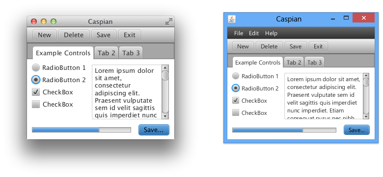
Below for comparison is the same Mac and Windows 8 windows above but this time using the current Caspian theme.
Modena Test Application
We have been developing a testing application in our open source project. It has a bunch of tabs that let you see various aspects of the new theme. For example we have a test for text alignment horizontally and vertically across controls so when you lay them out in a form or toolbar they all line up nicely.
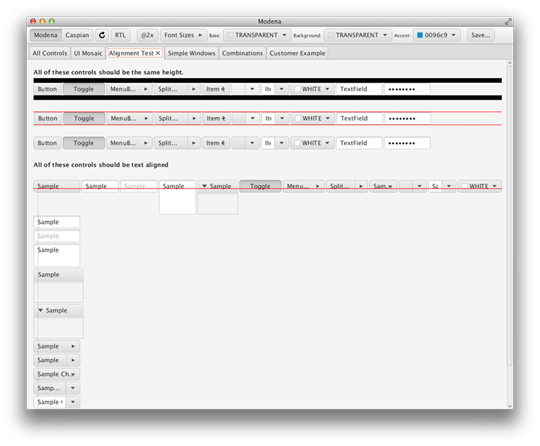
You can get the test app and run it your self it is in rt/apps/experiments/modena in our open source repo. You can clone the mercurial repo from hg.openjdk.java.net/openjfx/8/controls/rt. That repo will also contain the very latest working version of Modena.
Font size scaling
You may have noticed the difference in text size and the size of the controls in the windows above. One of the challenges we had with both Modena and Caspian is working with Windows Standard, Medium and Large fonts setting (Windows 7+ it is named 100%, 125% and 150%). We have handled this problem by setting the default font size in JavaFX to match the system it is running on. Then all the sizing for the controls is based on the “em” unit where 1em = font size. The result of this is as the font size changes the controls grow & shrink to match.
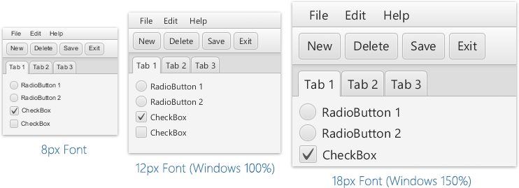
As well as scaling for different platforms and settings you can use this in your applications if you need smaller or larger controls for example in a tool palette you may want smaller sliders and combo boxes. In which case you can just set the font size for that panel in css to be smaller or larger. You can even set it relative to the platform font size so it will scale for people with high resolution screens.
Java
VBox myPanel = new VBox();
myPanel.addAll(new Slider(), new Button, new ComboBox());
myPanel.setId("myPanel");
CSS
#myPanel {
    -fx-font-size: 0.8em; /* 80% size of parent node */
}
All controls in Modena (Mac Font)

Feedback
We would love to hear your feedback and experience with testing Modena with your applications. So please leave comments below. We are trying hard to please most people and have a style the most people will really like, but personal tastes vary a lot. So we will do our best to incorporate any feed back.



Modena is still very much a work in progress for example as of now my list of known issues is:
1) Style ColorPicker Dialog
2) Tree sort icons styling
3) Make ColorPicker dialog resizable
4) List,Tree,Table hover styling
5) Table and TreeTable header styling
6) Add new test case horizontal list
8) Add new test case Cell Editing
11) HTMLEditor Size menu items get clipped bug
12) List CMD + arrow navigation styling
13) Move to new method of forcing state
15) Tab extras button needs new skin code
18) Menus add test & style
28) Choice Box
29) Arrows not centered
⁃ When larger than screen number of items, arrows look bad
30) Hyperlink
⁃ Should have even spacing between focus border and text
⁃ Should test text indent
31) TabPane
⁃ Should have even spacing between focus border and text
32) Non-editable Combo
⁃ should not look split into two buttons
⁃ Hover should be constant currently separate for two buttons
33) Combo, Popup Menus and Color Picker all popup parts should have same shadow.
34) HTML Editor needs different icons for numbered, bulleted list, indent and outdent when RTL
35) TabPane needs fade in out when extra tabs
36) ListView first cell is 1px higher than rest – (Should probably align with button etc)
37) ListView CMD Arrow row selection is odd, blue + orange
38) Table, Tree, TreeTable remove hover state
39) TreeView indent crazy big
40) TreeView Arrow not centered vertically
41) TableView cell formatting and borders are not nice
42) TableView header styling
43) Virtual Keyboard test in app and styling
44) Add date picker when it arrives
I want to know the base colour of button in modena
Its am pity that none of the sample programs work. It makes it very difficult to get started.
May I suggest reducing the corner radius? I think it would look more fresh and modern if all the corners weren’t so rounded.
same suggestion, besides that, looks awesome, I almost had an orgasm xD
Well, I would consider the same, reducing corner radius, but if some global option would be available (or maybe it is?) that would be really cool. Meanwhile such a beautiful new look and feel.
Very easy!
Simply apply a css stylesheet! You can ex override only the corner radius and leave everything else.
It looks wonderful in Linux. Great job!
Good job Jasper, looking forward using Modena with b74 🙂
Love it , good job!
Simply Awesome …!!!
Wonderful!
Why orange selection/active indicator?
Why not blue, instead?
Thanks
Looks very decent for most controls, but i really, really hate the choice of orange to highlight selections. With the exception of some linux desktops, orange is pretty much always used as a warning color. Why not stick with blue as both Windows and OSX do?
The ‘selections’ part in the comment above should have been focus, sorry for that.
Looking good!
Some personal thoughts:
– I personally also feel the corner radius are a bit too rounded. For instance, I prefer the rectangular progress bar on Caspian.
– I also think that red may be a bit too strong for showing that something is focused. Blue brings less attention.
On another note, is it possible to set a trail on the slider on a custom CSS file? That is, can the portion that goes since the beginning of the slider to the thumb have a fill color? I’ve found that most native look and feels have this.
Looks like a great basis for getting a decent looking app out of the box!
Another vote for less rounded progressbar.
why the name Modena ? it’s mai city.
(good job)
It seemed like a cool name with being close to “Modern” and also there is such a great heritage of design and engineering with cars etc in Modena that it seemed nice fit.
My take on it.
In general it looks a lot better than Caspian and I could actually use this. But it has some of the same problems as Caspian. In general things are too tall/high compared to their width which makes them look chubby.
Rounded corners have to big radius and it looks unprofessional. Reduce the radius.
Having a stark color like orange is bad bad. It will be unmodern fast and drag the rest of the UI with it when it does. Less is more.
The blue for default is too dark. So are the other example colors. The contrast to black text is to small.
Tabs are too tall/high. Again, looks unprofessional. Actually I think all components are too high. Good that they are the same height.
Buttons should have more horizontal margin and so should tabs.
Text on some buttons are not centered vertically, they are one pixel to high up. Very visible on the top right picture of the page.
The kerning on the text is bad. Look at the space between d and i in the “Radiobutton” label at the top.
Why is there a very bright pixelline to the right and bottom in a button? That doesn’t make sense shadow wise. There’s nothing there that can catch the light.
I don’t understand why the toolbar buttons in the top four screenshots are different from the button examples further down.
Hovered button gradient is a little too subtle. It doesn’t look like it has the same shape as the other states.
Armed and normal button look almost the same but not exactly the same. The normal one looks better.
Pill toggle button gradient goes from 239 to 221. Normal buttons from 239 to 222. Make it 221.
Selected button gradients doesn’t look credible. I can’t imagine a physical shape with lightning that would look that way.
CheckBox indeterminate has a too bright line under the dark gray line.
In general the highlight line is a tad too bright on the dark versions of the components.
The progress bar’s knob doesn’t have a round edge, it is slightly elliptic. And the track’s gradient needs an overhaul.
Tabs might look better with two or three pixels in between. Hard to say.
Tabs below is bright on the top, should be dark.
Accordion has a bright line below every key. Why?
Accordion arrow is fuzzy in the left edge. Off by 0.5 pixels.
Table view header “buttons” look crocked and impossible. Doesn’t follow the same design as everything else which makes it look out of place.
Charts looks fantastic but the legend inner grading needs an overhaul.
Scrollbar track knobs look flattened at the edges and also a bit fuzzy for some reason. And there’s the while line again which doesn’t make sense in the lower right region.
The shadow on the slider knobs are found nowhere else in the design and stands out. Also, it makes the button look off centered vertically. Reduce it until it is very subtle.
I could not agree more. This is a huge improvement over Caspian and very pleasant to the eye. Personally I think it would look even better with some small adjustments:
1. Buttons (and rows in lists, tables, etc.) are a bit too high. Too fat buttons don’t look good
2. Albeit the reddish-orange focus color looks nice to the grey of the controls, it does not go that well with the blue selection color. Either go completely blue or completely orange. Or use the selection colour of the operating system.
3. Fonts are too large. That’s 13pt? How about 12pt or 11pt? I hope that one day sub pixel font rendering wil be supported. Then those fonts will look crisp and sharp. And: The kerning might use some improvements, too.
4. Corners might benefit from a smaller radius. Too round does not look too good
Having said that, Modena surprised me very much and I really hope you guys keep up the excellent work. I love that it’s brighter, flatter and less 3D-ish than Caspian. Can’t wait for proper font rendering, too 🙂
Cheers
There are a couple of places where it seems that you have preferred aestethics over functionality.
1) Orange. Its standout-ish color makes its meaning ambigious; and it might clash with possible invalidation visuals.
2) The scrollbar (same problem in Caspian). It’s too thin (difficult to hit) and has too low contrast to its non-bar area (difficult to see). (The latter is slightly improved in Modena.) The scrollbar arrows are also way too small compared to e.g. checkbox, radiobutton.
I love javaFX very much, but sorry, why focusing on this things? but still can’t “always on top”?
Keeping JavaFX looking current and modern is also important. Also it is different people who work on Glass (Platform Integration Layer) that will need to add always on top.
Good luck, it’s amazing.
Sorry, my bad. The buttons in the toolbar looks the same as the normal buttons. I was fooled by the gradient. Also sorry for my bad spelling.
Please change that orange color. It clashes against blue, but not in a good way.
I developed a fondness for the blue in Caspian…
Very nice work! I’m going to be boring and just add my +1 to what’s been said already: the corners on the progress bar are too rounded.
By the way, why is the text kerning on the Mac versions wrong? I see it’s wrong in the Caspian screenshots, too.
Why ubuntu has menu bar? Please fix it by removing this menu like in mac.
It is because we don’t have native menu bar support for Ubuntu. Please file a JIRA feature request if this is something you need.
Anyone else see that poor font rendering kills any good attempts in JavaFx?
I agree, it’s a thorn in our side at the moment. As a designer, I want to see it fixed asap – rest assured we are working on it!
I appreciate so much the great effort made to modernize the java ui style.
Just want to point the attencion on bar charts: rounded, and colors are too aggressive. I prefer No rounded bars (to stick with the minimal style) and more pastel colors like the ones in line charts.
Having a hard time looking at any of those screenshots because the font rendering is so damn awful. I thought nothing was worse than Silverlight, but JavaFX really takes the cake on unreadable text.
As to my understanding, JavaFX 8 will do native font rendering so it will be up to the operating system to render your fonts pretty (aka properly hinted and antialiased).
Hello,
I tried to add this in my application by using code as you have suggested.
Code:
@Override public void start(Stage stage) throws Exception {
….
setUserAgentStylesheet(STYLESHEET_MODENA);
….
}
I found following error when I run my application,
Error : java.lang.NoSuchMethodError: javafx.application.Application.setUserAgentStylesheet(Ljava/lang/String;)V
Please help me and tell how to implement your styles in my application.
Thanks in Advance.
Are you using Java 8? this API was added in Java 8
I posted this to the OTN Community but have had no replies. I am experiencing an issue with the HTMLEditorSkin as the stack trace below shows. This is probably not appropriate here, but perhaps someone has had a similar issue and can help.
I have an application that runs well in Java 7, JavaFX 2.2 in all environments. It features an HTMLEditor Singleton that delivers an instance of the HTMLEditor component wherever needed.
After I built the project on Java 8 (b121), the HTMLEditor failed to be added to the scene graph and the HTMLEditor skin threw a null pointer exception.
The partial stack trace is as follows:
Exception in thread “JavaFX Application Thread” java.lang.NullPointerException
at com.sun.javafx.scene.web.skin.HTMLEditorSkin.populateToolbars(HTMLEditorSkin.java:768)
at com.sun.javafx.scene.web.skin.HTMLEditorSkin.layoutChildren(HTMLEditorSkin.java:1198)
at javafx.scene.control.Control.layoutChildren(Control.java:574)
at javafx.scene.Parent.layout(Parent.java:1076)
at javafx.scene.Parent.layout(Parent.java:1082)
at javafx.scene.Parent.layout(Parent.java:1082)
I’m using Kepler Eclipse on a PC, currently. In one version, I did not recreate the FXML. I ran as is with no changes other than to remove deprecated methods, which are unrelated. In another version, as an experiment, I used SceneBuilder to layout the HTMLEditor component and that rendered fine.
In the non-working version, I am re-parenting the component on the scene graph as needed.
Finally, I have tried both Caspian and Modena in JDK8. Same result.
File a bug at https://javafx-jira.kenai.com/secure/Dashboard.jspa Looks like it might be a resource finding issue because of OSGi class loaders
I am using TextFlow to show log using javafx Text, problem is I am unable to select Text or highlight it on mouse click. Can you suggest some??
I want to know how to achieve the “Nice Colors Button”.
Thanks in Advance.
You can color any JavaFX control or a panel with its sub-controls by setting “-fx-base: red;” in CSS. For example:
Button foo = new Button("Dude");

foo.setStyle("-fx-base: red;");
Also the source for Modena test available in OpenFX:
        newSection("Nice Colors:",

                ButtonBuilder.create().text("Button").style("-fx-base: #f3622d;").build(),

                ButtonBuilder.create().text("Button").style("-fx-base: #fba71b;").build(),

                ButtonBuilder.create().text("Button").style("-fx-base: #57b757;").build(),

                ButtonBuilder.create().text("Button").style("-fx-base: #41a9c9;").build(),

                ButtonBuilder.create().text("Button").style("-fx-base: #888;").build());
Is there a styler for Modena i.e. such as the Caspian Styler found in the FX Experience tools ? thanks
I have not written one or seen someone do one yet. It would be cool. It should be way simpler to do as we made the CSS stylesheet for Modena better organized so settings are more standardized and centralized.
Where I can find the source code of the test application used to check the Modena theme?
Thanks
Its available in OpenJFX http://hg.openjdk.java.net/openjfx/8u/rt/file/1942db1e52a9/apps/samples/Modena
Great, thanks for the link.
Do you any live theme editor for JavaFX ?
Just see the scenic view 🙂
Great tool..
I want to know the base colour of button in modena
The constructor TableFilter is deprecated.When i tried to filter a column only the check box are listing. But when i selected the checkbox it showing its value. why is that???