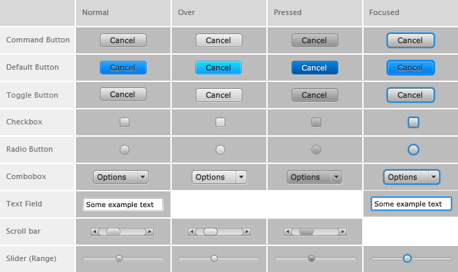
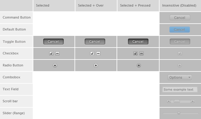
The new JavaFX controls were designed to be easily skinable so that you can create any look you can think up but we still need a default look that you get out of the box. The default skin that comes with JavaFX 1.2 is called Caspian which aims to be flexable and usable as is for a wide range of applications. I thought I would share a little about the design decisions I went through in designing Caspian.
The Requirements
- Needs to work in many types of applications from product sites though strong branded corporate sites to sparkly web 2.0 sites.
- Has to fit in and look in place on Windows, Mac, Mobile and TV
- Must not look identifiably like any other look
- Should complement the design of a application not over power it
The Technical Requirements
- Need to be CSS themable so the designer/developer can customize it to fit into their product design
- Vector based so that the controls look good even when scaled , rotating, animating etc.
- Needs to be technically simple so that it is fast to render
The Color
- Has to be gray to fit in with the current fashion and the widest range of products
- Needs an accent color for important UI parts such as focused items and default buttons on a dialog where the user attention needs to be drawn
- Has to work on wide range backgrounds

Initial Design
After experimenting with lots of designs and researching what other people are doing in the field here are the initial designs I did in Photoshop.


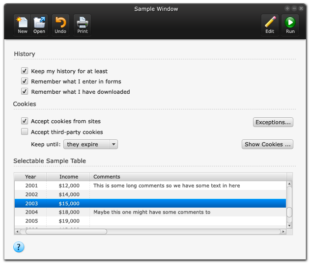
Example Window Design

Testing on a extreme range of colors
Hope you found that interesting the next few blogs on Caspian will cover how to style controls with CSS and how to make custom skins.


Looks very good!
Looking forward to the blog post about custom skins.
Btw, please don’t only do the standard Button in the tutorial, but also for example a more complex control like ListView.
/Pär
Hi Jasper,
Verry slick. Can we expect a post on how to restyle these, not only colors but also shape, behavior, animations? Our designers need to know how far they can push it.
The window decorations, will it to be included in core JFX? If not maybe you could donate it to JFXtras?
Thanks for sharing, great blog so far!
@Jo
I just published a new blog entry on the different ways to style something. What you really want is I think what is coming in the next release — full CSS customizability for Controls. At the present time, the best supported option is to fully replace the Skins. This is just due to time constraints on this release.
The window decorations is a good question. We’ve talked about the need to have a “WindowView” Control or something along those lines so that creating custom window’s is easier (what happens right now is you turn the stage to be transparent and then have to implement your own buttons and drag handling — we’d like that to be for free).
Looks really nice.
Will there be a Caspian skin on Java swing?
Thanks.
Hi Pedro,
We have no plans to provide a Caspian style skin for Swing, however, using Nimbus it shouldn’t be to hard for somebody to port the skin designs over using Painters. See Jasper’s other blog http://www.jasperpotts.com/blog/ for more information on skinning Swing with Nimbus
In the screenshot above, you have some form of separator below the headings ‘History’ and ‘Cookies’, I am wondering what visual control you used for that?
The sample window looks very clean, modern and un-cluttered, I think congratulations are in order 😉
Additionally, do you use a GUI builder tool, or is this all hand-cranked?
Cheers,
Rob.
Hey Rob,
This will be just a Separator in the next release. This image is actually part of the design documents — the TableView on the bottom hasn’t been implemented yet and combo/choice box is in progress.
Cheers
Richard
For now you can just use a Line for now.
Line {
endX: WIDTH _NEEDED
stroke: Color.rgb(194,194,194)
strokeDashArray: [2,2]
}
Very very nice…..what exactly are the names of the various colors? i would like to play with these when i get the chance!