Important Note: Menus (and related classes) are ‘preview’ API in JavaFX 1.3, which means that the API may (and most probably will) change in future releases. However, you’re welcome to make use of these preview controls in 1.3. Read on to learn how.
Up until the release of JavaFX 1.3 it was not possible to build proper menus that ‘popped’ out of the Stage, as one expects a menu to do. It was not until we were able to expose other functionality internally that creating proper menus became possible. As already warned, in JavaFX 1.3 menus are preview controls whilst we firm them up and get feedback from the community. In this post I wanted to outline the API, and what options you have for styling them using nothing more than CSS.
All Menu-related controls are, for JavaFX 1.3 at least, located in the com.javafx.preview.control package. This package is the staging ground for all preview controls in JavaFX 1.3, and includes menu-related controls, as well as ToolBar, TreeView, MenuButton and SplitMenuButton. We’ll be covering those separately.

A simple menu in JavaFX 1.3
Menus can be used in a number of different places, for example, attached to a MenuBar, contained within another Menu, shown when called programmatically (e.g. MenuButton), and used as context menus (although this should be achieved using PopupMenu rather than Menu). For all these use cases, your first port of call should be the Menu control. Menu may be populated with any type of Node, however, in general only subclasses of MenuItemBase or a Separator are used as items for a Menu. Examples of controls that subclass MenuItemBase include Menu, MenuItem, CheckMenuItem, RadioMenuItem and CustomMenuItem. CustomMenuItem is a very early preview control, but it is the best way of embedding other, miscellaneous Nodes inside a Menu. Separator, of course, is a new and final control in JavaFX 1.3.
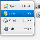
Creating a Menu in JavaFX is simple. Here is some sample code that will create a ‘File’ menu, common in many applications:
[jfx]
Menu {
text: "File"
items: [
MenuItem {
text: "New"
graphic: ImageView { image: Image { url: "{__DIR__}new.png" } }
action: function() { textbox.text = ""; }
}
MenuItem {
text: "Open…"
graphic: ImageView { image: Image { url: "{__DIR__}open.png" } }
action: function() { println("Open") }
}
MenuItem {
text: "Save"
graphic: ImageView { image: Image { url: "{__DIR__}save.png" } }
action: function() { println("Save") }
}
MenuItem {
text: "Save As…"
graphic: ImageView { image: Image { url: "{__DIR__}save_as.png" } }
action: function() { println("Save As…") }
}
Separator { }
MenuItem {
text: "Exit"
graphic: ImageView { image: Image { url: "{__DIR__}exit.png" } }
action: function() { FX.exit(); }
}
]
}
[/jfx]
Note: Whilst MenuItems allow for an accelerator to be set (as shown in the first screenshot), this API is currently not hooked in to any event system within JavaFX 1.3. In a future release this will of course work as expected, and we’ll blog more about this then.
Sub-Menus
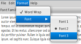
To have a submenu in a menu, you simply do add a Menu into the items sequence, and this can be repeated to whatever depth is necessary for your application. For example, here is a rather simple example of having one submenu:
[jfx]
Menu {
text: "Format"
items: [
CheckMenuItem {
text: "Word Wrap"
selected: bind wordWrap with inverse;
},
Menu {
text: "Font"
items: [
MenuItem { text: "Font 1" }
MenuItem { text: "Font 2" }
MenuItem { text: "Font 3" }
]
}
]
}
[/jfx]
CheckMenuItem and RadioMenuItem

CheckMenuItem and RadioMenuItem in JavaFX 1.3
As can be seen in the code example above, the first MenuItem is actually a CheckMenuItem, which means that it will draw a check mark to indicate to the user whether it is currently selected or not. You can see a screenshot of a selected CheckMenuItem to the right. As a developer, you can bind to the selected boolean to be informed when this property changes, and react accordingly.
The other important type is of course RadioMenuItem, which is normally used to allow for mutually-exclusive selection of a single item in a group. To do this, you should create a ToggleGroup and assign it to all RadioMenuItem’s in this group (and for those wondering, this is the precise reason why we broke the ToggleGroup API in JavaFX 1.3). For example, you could create a Menu with three RadioMenuItems belonging to a single group as such:
[jfx]
var fontGroup:ToggleGroup = ToggleGroup { }
Menu {
text: "Font"
items: [
RadioMenuItem { text: "Font 1", toggleGroup: fontGroup }
RadioMenuItem { text: "Font 2", toggleGroup: fontGroup }
RadioMenuItem { text: "Font 3", toggleGroup: fontGroup }
]
}
[/jfx]
Styling Menus using CSS

Menus as used in the Authoring Tool
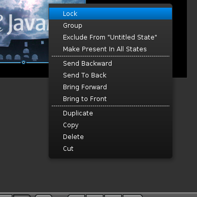
Menus, as with all controls in JavaFX, can be easily styled using CSS. To the right is a styled menu that is being used in the JavaFX Authoring Tool. Note that the gradient runs from the top of the menu to the very bottom, yet the selection gradient runs only from the top to the bottom of the currently selected menu item: this is trivial using CSS.
Because a Menu is made up of a lot of items, be sure to refer to the official JavaFX 1.3 CSS guide that is due soon – this will be the best way to understand all regions that can be styled in CSS. What follows below is a relatively brief introduction that illustrates how the Authoring Tool folks reskinned the menu as is shown to the right. In future posts we’ll dive into far more detail about styling all other aspects of the menu.
*.popup-menu {
    -fx-background-color:
        linear (0%,0%) to (0%,100%) stops (0%,#383838) (100%,#141414);
}

.menu {
    -fx-text-fill: #ffffff;
}

*.menu-item {
    -fx-text-fill: #ffffff;
}
I hope that this post gives a good introduction to the basics of creating menus in JavaFX 1.3, and styling them. In a future post we’ll dive more deeply into how to use menus in various use cases (i.e. as context menus), and as mentioned, look more deeply at styling a menu to more closely suit the needs of your software.


Your menu example implies keyboard hot keys. (Ctrl-S)
Is this ‘real’, and if so, how do they work, I can’t seem to see anything obvious for handling keyboard acceleration in JavaFX.
Note the disclaimer under the first code snippet – the API is somewhat there, but nothing is listening to the keyboard input currently unless you roll your own solution.
In fact, the API is there, but it’s ‘hidden’ in the JavaFX docs until we get the rest of the event system in place in a future release. At that point the keyboard accelerator support will be made visible.
You are right. My apologies, missed the footnote.
In past releases I was able to tap into some kind of Swing event stream to get keyboard actions. It was exceedingly dodgy however.
Yes, I’m fairly certain there are ways to achieve accelerator support now, but I’m not 100% certain on the best approach. I know the Authoring Tool folks have done precisely this however, which is why the accelerator API is provided in the preview control, even if it isn’t hooked into anything.
Regardless, I look forward to seeing menus used in TwitterFX 🙂
Seems nice, but it’s sad can’t use it in a real app…
These “preview” controls will be stop to be “preview” only in 1.4 version??
William, there is no reason why you can’t use these in a real app as far as I know. In fact, that’s the whole reason why we released these preview controls – to get feedback from people willing to use them in real world applications.
Of course, there is the caveat that these preview controls may have their API’s changed in future releases, but I would say that it’s unlikely to be major upheaval. In other words, please do use these preview controls.
I’m not sure when we’ll change these preview controls from being preview into fully-fledged public APIs, but we’re not going to sit on our hands. Basically we want to hear feedback from the public, and based on that we’d like to turn our preview controls into full controls as soon as is possible.
I have done styling of context menu in javafx1.2.I am able to set icons for matrix ans set colors also iam putting code here
.root {
-fx-background-color: cornsilk;
-fx-padding: 10;
}
.context-menu {
-fx-background-color: #C8CFD7;
-fx-border-color: #BBC2CC;
-fx-text-fill: white;
}
.menu-item .label {
-fx-fill:red;
-fx-font-family:tahoma;
-fx-font-size: 12px;;
-fx-stroke:#C8CFD7;
-fx-strok-width:.25;
}
.menu-item:focused .label {
-fx-text-fill: white;
}
.menu-item{
-fx-border-color: #DDDEE2 transparent #B9C0C8 transparent;
-fx-border-width:0.50px;
}
.menu-item:focused {
-fx-background: -fx-accent;
-fx-background-color: #7092BE;
-fx-text-fill: -fx-selection-bar-text;
}
import javafx.application.Application;
import javafx.fxml.FXMLLoader;
import javafx.scene.Group;
import javafx.scene.Node;
import javafx.scene.Parent;
import javafx.scene.Scene;
import javafx.scene.control.ContextMenu;
import javafx.scene.control.Label;
import javafx.scene.control.MenuItem;
import javafx.scene.control.TextArea;
import javafx.scene.image.Image;
import javafx.scene.image.ImageView;
import javafx.scene.layout.GridPane;
import javafx.stage.Stage;
import javafx.geometry.Insets;
/**
*
* @author nidhi.a.agrawal
*/
public class Context extends Application {
@Override
public void start(Stage stage) throws Exception {
// Parent root = FXMLLoader.load(getClass().getResource(“Sample.fxml”));
TextArea notification = new TextArea();
ContextMenu contextMenu = new ContextMenu();
Node itemIcon = new ImageView(new Image(getClass().getResourceAsStream(“icon_createnew.png”)));
Node con_test_hierIcon = new ImageView(new Image(getClass().getResourceAsStream(“icon_Configure_Test _Hierachy.png”)));
Node cutIcon = new ImageView(new Image(getClass().getResourceAsStream(“icon_cut.png”)));
Node copyIcon = new ImageView(new Image(getClass().getResourceAsStream(“icon_copy.png”)));
Node pasteIcon = new ImageView(new Image(getClass().getResourceAsStream(“icon_paste.png”)));
Node insertIcon = new ImageView(new Image(getClass().getResourceAsStream(“icon_insert.png”)));
Node editIcon = new ImageView(new Image(getClass().getResourceAsStream(“icon_edit.png”)));
Node renameIcon = new ImageView(new Image(getClass().getResourceAsStream(“icon_rename.png”)));
Node deleteIcon = new ImageView(new Image(getClass().getResourceAsStream(“icon_delete.png”)));
Node tagIcon = new ImageView(new Image(getClass().getResourceAsStream(“icon_tag.png”)));
Node refreshIcon = new ImageView(new Image(getClass().getResourceAsStream(“icon_refresh.png”)));
MenuItem sap_new = new MenuItem(“Create New Sap System”, itemIcon);
MenuItem con_test_hier = new MenuItem(“Configure Test Hierarchy”, con_test_hierIcon);
MenuItem cut = new MenuItem(“Cut”, cutIcon);
MenuItem copy = new MenuItem(“Copy”, copyIcon);
MenuItem paste = new MenuItem(“Paste”, pasteIcon);
MenuItem insert = new MenuItem(“Insert”, insertIcon);
MenuItem edit = new MenuItem(“Edit”, editIcon);
MenuItem rename = new MenuItem(“Rename”, renameIcon);
MenuItem delete = new MenuItem(“Delete”, deleteIcon);
MenuItem tag = new MenuItem(“Tag”, tagIcon);
MenuItem refresh = new MenuItem(“Refresh”, refreshIcon);
//sap_new.setStyle(“-fx-background-color:red;”);
// filemenu.setGraphic(new ImageView(new Image(“icon_createnew.png”)));
// editmenu.set
contextMenu.getItems().addAll(sap_new,con_test_hier,cut,copy,paste,insert,edit,rename,delete,tag,refresh);
// contextMenu.setStyle(“-fx-background-color:red;”);
notification.setContextMenu(contextMenu);
Group root = new Group();
root.getChildren().add(notification);
Scene scene = new Scene(root);
scene.getStylesheets().add(Context.class.getResource(“contextcolor.css”).toExternalForm());
stage.setScene(scene);
stage.show();
public static void main(String[] args) {
launch(args);
}
}