One of the missing features of JavaFX in the 2.0 release was a ComboBox control, and I’m very pleased to say that we’ll be filling this gap in JavaFX 2.1. Indeed, it is already in the developer preview builds we’re putting out, and has been sitting in the OpenJFX mercurial repo for some weeks now. I’m fortunate enough to even be getting bug reports filed in our Jira issue tracker, which is justification enough to be getting early developer preview releases out into your hands as early as we have!

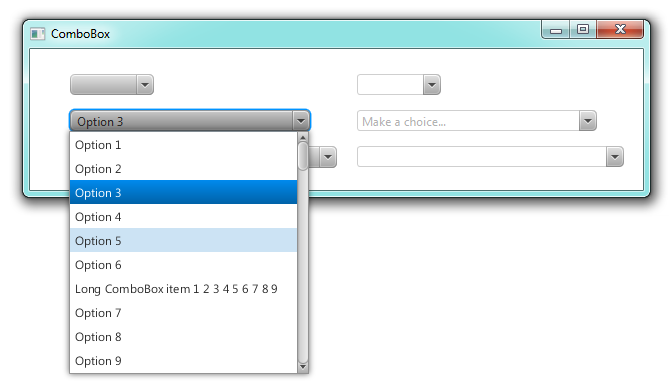
Non-editable and editable ComboBox controls of all shapes and sizes!
In the screenshot above you can see what the default ComboBox looks like. On the left you can see three non-editable ComboBox controls, and on the right you see three editable ComboBox controls. The default width of a ComboBox is based on the width of the content of the ComboBox, so that the menu appears as roughly the same width. You’ll note that the bottom-left ComboBox has a different font – this is because this ComboBox has a cell factory set on it, which is something I’ll cover shortly.
A quick detour: What is ComboBoxBase?
The ComboBox control is an extension of the ComboBoxBase class. For most developers this distinction is unnecessary, but for those of you wanting to write your own ComboBox-like control (which I hope is many 🙂 ), the following is worth reading. The ComboBoxBase class is an abstract class, whose goal is to represent the core concept of what a combo box is. ComboBoxBase brings the basic API expected across all combo box implementations. Firstly, it has a value property, which represents either the latest selection the user has made, or the latest input they have provided in the case of editable combo boxes. It also has the show() and hide() methods you would expect. The third key piece of API is the editable property, which specifies whether the ComboBox should allow user input. There is other API also, but what I’ve mentioned here is the core of it.
As mentioned above, ComboBoxBase is intended to represent the nature of all combo boxes – that is, a combo box is generically a button that, when clicked or otherwise prompted, shows to the user a number of choices. Examples of other, ComboBox-like controls include calendar pickers and colour choosers, but even extends to use cases where entire dialogs are popped-up on clicking. The ComboBoxBase does not pretend to know what happens when show() and hide() are called, and that is left up to subclasses whose skin extends the abstract ComboBoxBaseSkin class. For more information, refer to the ComboBox class and its ComboBoxListViewSkin skin class in OpenJFX. If all else fails, leave a comment on this post or email me with your questions.
To cement what I mean in the above two paragraphs, the ComboBox class extends ComboBoxBase to provide the most commonly used ComboBox form, which is the kind that displays a popup list from which a user may choose one option. You can see what the popup list looks like in ComboBox in the screenshot below.

A non-editable ComboBox with a popup list showing
ComboBox API
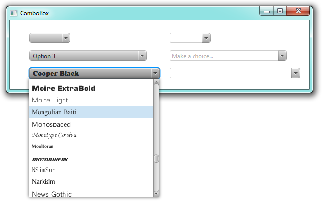
The ComboBox control in JavaFX 2.1 has a very familiar API to anyone who has built user interfaces in JavaFX 2.0. It brings with it API from ListView, Button, ChoiceBox, and even a little bit of TextField. For example, ComboBox borrows from ListView (as well as TableView and ChoiceBox) the concept of having an items list that contains all elements to show to the user. The generic type of the ComboBox represents the type of the items list. In addition to this, ComboBox has a cell factory using exactly the same API (including ListCell) as the ListView control. This is why in the first screenshot above you see the bottom-left button has a different font – it is actually Cooper Black, as the bottom-left ComboBox has been populated with the fonts found on my computer. What this means is that the cell factory is used not just for the popup list, but it is also used in the ComboBox ‘button’ itself. Check out the screenshot below to understand better.

A ComboBox with a custom cell factory
Another very useful addition to the ComboBox API (and one which has been retrofitted into the ChoiceBox API as well) is the support for StringConverter implementations (which in reality deserves its own blog post to detail the availability of the javafx.util.converter package and the ability to use these converters in the binding API as of JavaFX 2.1. Maybe Michael Heinrichs might cover this, *hint* 🙂 ). A StringConverter does exactly what the name suggests: it has two methods, one that takes an Object and returns a String, and the other that takes a String and attempts to return an Object. StringConverter implementations are therefore used within ComboBox for two purposes. Firstly, the ComboBox items list (and the text on the ComboBox button), when displayed to the user, is run through the StringConverter before being displayed. Secondly, it takes the commited text input and attempts to convert it to a object that can then be set in the value property.
The ComboBox makes use of the familiar SelectionModel API that is present in a number of other controls such as ListView, TreeView, TableView, ChoiceBox, TabPane, etc, and it works in the same way. One important point to note is that the ComboBox selection model is a SingleSelectionModel, so the ComboBox control will only ever support single selection. A future, separate control (e.g. ListBox or similar) might support multiple selection.
Conclusion
Hopefully with this post you’ll have a better understanding of what the ComboBox in JavaFX 2.1 can do. If you have any questions, please leave a comment on this post. If you find a bug, please file it in Jira.


Is the ChoiceBox component still useful now that ComboBox is available?
Yes, the ChoiceBox control is ideal for situations where the number of choices is small, whereas the ComboBox control is good when the number of choices is large. This would be how I base my decision on which to use.
.show() should have been.showPopup()
Then it would be inconsistent with all other API which is show().
What an excellent design with the SelectionModel, CellFactory and StringConverter integration. These controls are so flexible. It is a amazing!
Your post reminded me about a question I’ve had. Why are the scroll bars so narrow? They seem like they should be wider.
+1 for scroll bar
it looks unusually very narrow in javafx
Indeed, the scrollbar width is narrow, but this is by design. Fortunately, this is trivial to change with a little bit of CSS. In fact, I believe there is a sample in the Ensemble sample app on how to do this.
Does it support autocomplete out of the box?
No, it doesn’t support autocomplete out of the box, although it is something I want to add in JavaFX 3.0 if time permits.
Jonathan you are superb!! 🙂
I had made this kind of control too. I think I’ll publish my modified control of AutoFillTextBox very soon. The new AutofillTextBox will now contain the option of displaying data like of combobox.
Thanks
Narayan
When you activate the combo box in edit mode
Entry Key put the value directly into the text field before pressing the
getvalue option values are not imported.
gettextvalue fouced out at me in a text field will automatically set the value please.
Please file a bug in Jira at http://javafx-jira.kenai.com
Hi. Jonathan Giles !
I’m Republic of Korea is a place to live
I do not speak English well.
Thank you for your suggestion.
I have found out 3 bugs using the ComboBox in 2.1 & 2.2.
First Bug.
ComboBox Edit Mode -> Fouces out at the setting value input CobmoBox
second Bug.
ComboBox Edit Mode ->
Editor mode eases is the first panel shows the configuration editor mode is not doeseo.
Three Bug. – Fx2.2
first, second bug no fix!!
and JavaFX 2.2 – out of focus when the Enter Key is not input.
Support your answer Thanks.
Hi, I can’t open the combobox programatically by using the show. I actually need this in order to use the combobox as cell editor (swing terminology) in a TableCell the following way :
@Override
public void startEdit() {
super.startEdit();
if (ratingComboBox == null) {
ratingComboBox = new RatingComboBox(Model.getInstance().ratings);
}
setText(null);
Integer item = getItem();
int index = Model.getInstance().ratings.indexOf(item);
ratingComboBox.getSelectionModel().select(index);
//ratingComboBox.setDisable(false);
//ratingComboBox.setVisible(true);
// request that the ComboBox display the popup aspect of the user interface.
ratingComboBox.show();
setGraphic(ratingComboBox);
}
The combobox won’t open though so you need to click a second time (first time in the cell to enter the start edit function, second time to display the popup aspect of the combobox).
I then tried the following simple code that just opens a combobox in a scene :
// ComboBox
RatingComboBox ratingComboBox = new RatingComboBox(
Model.getInstance().ratings);
ReadOnlyBooleanProperty p = ratingComboBox.showingProperty();
ratingComboBox.show();
p = ratingComboBox.showingProperty();
With RatingComboBox implemented thsi way :
public class RatingComboBox extends ComboBox {
public RatingComboBox(ObservableList items) {
super(items);
setOnKeyReleased(new EventHandler() {
@Override
public void handle(KeyEvent t) {
/*
* if (t.getCode() == KeyCode.ENTER) {
* commitEdit(textField.getText()); } else if (t.getCode() ==
* KeyCode.ESCAPE) { cancelEdit(); }
*/
}
});
}
@Override
public void show() {
super.show();
}
}
The showingProperty correctly updates from false to true, but the combobox doesn’t open. So is there some invalidate function (Swing terminology) to call to open the combobox programatically? Or what else could be wrong?
Thanks.
How to code uppercase only for control combobox and textfield ?
Please help me…
hi, i am looking for a way to react on pressed enter-key. By default, no key-event will be raised. So i don’t know how i can detect such a key-event.
Is there another way to solve my problem as to implement an own behaviour?
thanks
hi, i solved my problem after a long time:
i register a key-event handler for key typed and check the character for \n. So i can detect when enter was pressing.
Hi there, after reading this awesome article i am too happy to share my familiarity
here with friends.